If you’re a creative then you know a great portfolio site is really valuable.
But when you’re showing your works online you can’t just have great work. You also need a great design for your site.
Anyone who’s ever done web design before likely knows that portfolios vary greatly.
Yet there are some best practices that all great portfolio websites follow. And in this post I’d like to share my thoughts on what makes a portfolio site truly impressive.
Whether you’re designing your own site or launching your very first portfolio ever, this post is sure to help with practical ideas to apply into your website.
Clarity On The Homepage
Most people visit portfolio websites from the homepage. That means you need a stellar homepage that clarifies what you do.
This can be as simple as a big heading on the page or as complex as many little features scattered throughout the page. No single right way to do it, but you definitely need clear content on your main page.
I think great creative portfolios have at least 3 pieces on their homepage:
- • A clear brand(or the person’s name)
- • Easy contact information
- • Work samples
The portfolio of Osvaldas Valutis is a brilliant example of how simplicity can work surprisingly well.
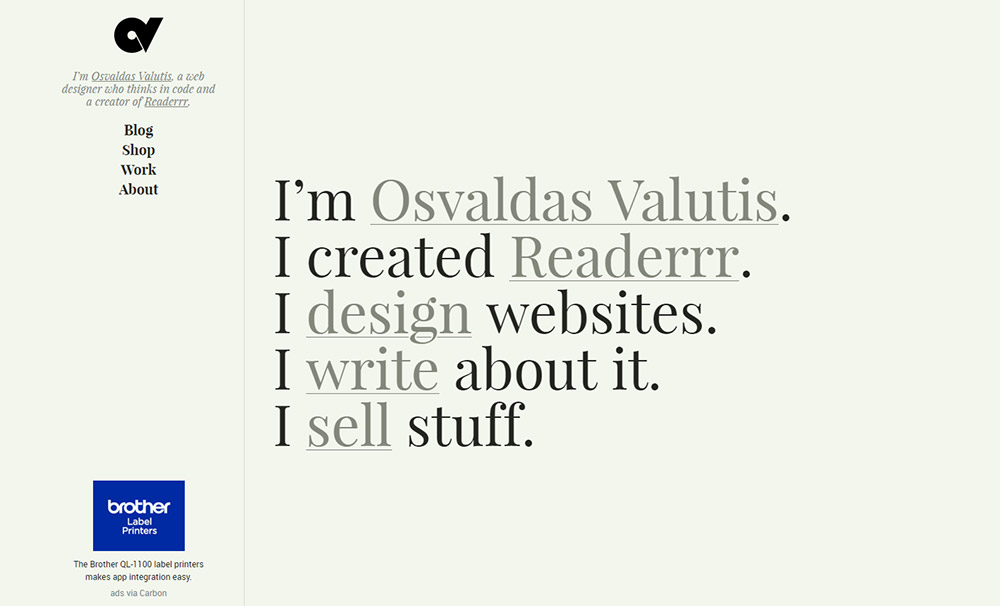
Right from the first pageload you’ll find a bunch of custom page animations to grab your attention. These animations show text effects for Osvaldas’ line of work.
Just by skipping the main page you can tell he does web design & coding.
The page also clarifies this directly underneath the main logo. That’s certainly the right place to put a tagline for your portfolio too.
Notice the key point here is that you can quickly tell what this portfolio is for and what kind of work they do. Links include samples of work but that’s not what people care about at first glance.
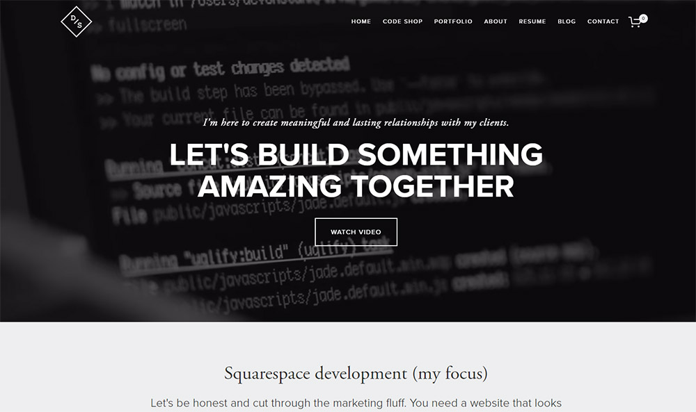
On the homepage of Devon Stank’s portfolio you can find a very similar structure. However the design focuses much more on graphics and whitespace to lure you further into the site.
Devon clarifies himself as a Squarespace developer right in the first heading. That is a great idea for anyone who specializes in certain areas.
Clients are much more likely to hire a specialist who knows their stuff and can deliver quality results.
But how would they know anything about your work if they can’t see it? That’s the value of clarity on the homepage and it goes far beyond just showing off your past work.
Sell Yourself & Your Work
Along with selling your portfolio you also need to sell yourself as a person.
Most clients want to work with someone who’s accessible, communicates well, and sticks to deadlines. They also want to connect with people who have personalities they like.
You can’t tell all of this on a website. But you can give people a slice of yourself with some photos, a little write up about yourself, and maybe some extra pieces on an “about me” page.

Take the example of Gary Sheng who uses a hero header with a large background image. The photo shows Gary alongside some text telling you what he does.
Selling himself and selling his work. It’s a combo that cannot be beat.
Some people feel uncomfortable putting themselves online and that’s certainly fine. You don’t need to add a personal photograph.
But it helps a lot if you can add some personal details about yourself like where you’re from or your past experience in the field(whatever that may be).
Typically I still feel that photos are the best way to sell yourself quickly.
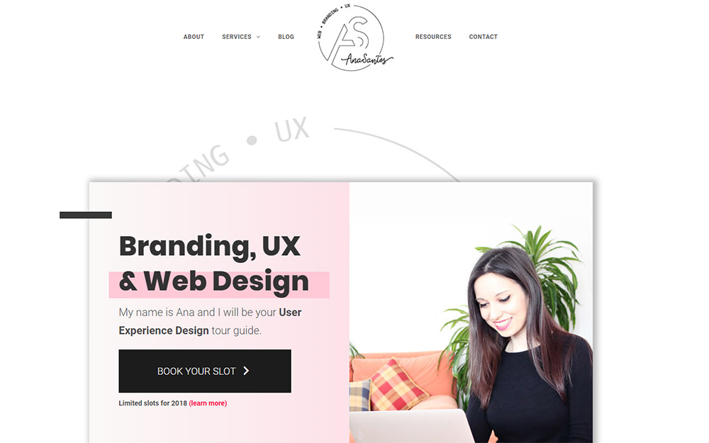
Ana Santos has one of the best portfolios I’ve ever seen when it comes to personalization.
All of the colors and typography blend so well and they give a certain “mood” to the page. This mood seems to match with Ana’s creative style so it really feels like this website is her website.
Notice that on the homepage there’s only a couple photos near the header. They aren’t very big either.
Yet they have such a huge impact on the experience as you scroll down the page. A little bit of personality really does affect your overall design.
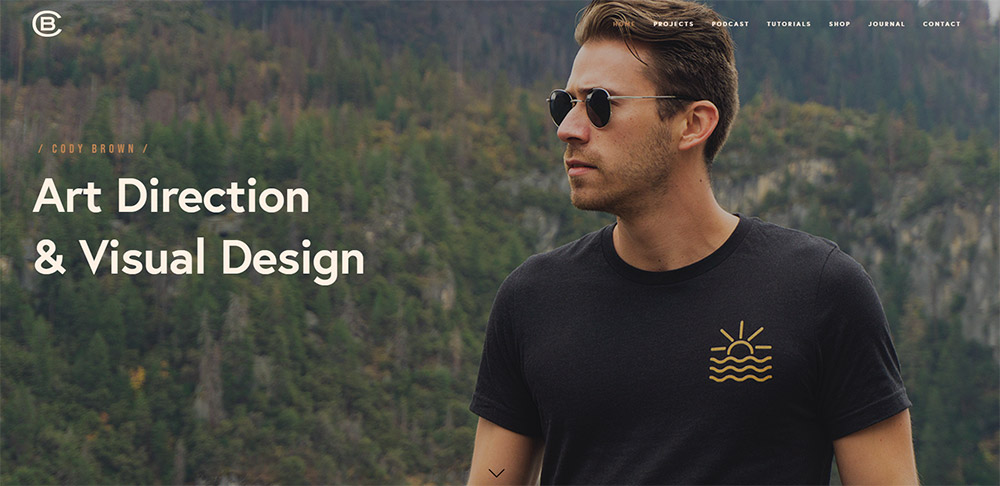
On the homepage of Cody Brown you’ll find a design with a big oversized header photo. This immediately grabs attention just because of the placement, but it also gives you a chance to experience the person behind the website.
Cody doesn’t have any designated “about me” page in the navigation so the homepage makes up for that.
But you can follow this trend however you feel most comfortable, so long as you give visitors a sense of who you are.
Create A Usable Experience
This might go without saying but you need to create a website that’s usable.
Visitors who aren’t tech-savvy should have no trouble browsing your site.
But designing your own creative portfolio is never a clear path. There’s a lot of variations you might try along the way and many different features you’ll want to add.
I recommend starting small a designing only what you need at first. Throughout that process you can always add features or tweak things, but if you start small you’ll never feel overwhelmed and you’ll always place a focus on the experience first.
Here’s a fine example from the portfolio of Melanie Daveid who actually does UX design.
With someone in that line of work you’d expect a great experience. And in this case you get just what you bargained for.
If you’re ever stuck looking for UX ideas try Googling for “ux designer” or search for UX portfolios online. You’ll be surprised how polished they are and you’ll definitely pick up some usable ideas.
From a totally different angle check out Nate Hallinan’s site focusing on concept artwork.
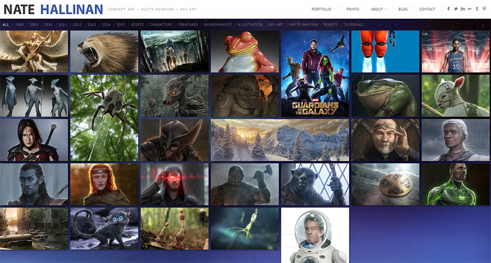
If you look right under the main nav you’ll see a list of categories for the work. This way people can sort Nate’s work based on environments, characters, tutorials, stuff like that.
Artist websites are certainly different because they need to convey the artistic process along with the final piece. Not to mention very few artists also understand interface design.
But if you look around you can find plenty of ideas geared towards the visual arts. Like in this article from the art blog Concept Art Empire you’ll find dozens of viable design techniques that you can apply to your portfolio website.
Now you shouldn’t use all of those on one page. It’d push the limits a little too far and feel a bit forced.
Instead pick the techniques you really like and jot them down. Ignore the rest.
Then find a way to combine them into your own unique layout.
I always say visual artists should stick with minimalist layouts but add their artwork into the page design.
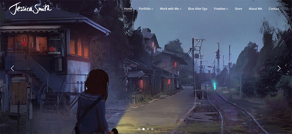
For example Jessica Smith has a very simple design with a focus on usability.
The only complex elements are the ones in her main portfolio listing that features larger images, slideshows, and sliding carousels.
Is that worth adding into your site? Well that’s for you to decide.
But like I said before: if you focus on the user experience first you can always add features as you go.
Encourage New Clients
Nobody launches a portfolio site just for fun. Typically there’s some kind of goal whether you want to add your link into job applications or land more freelance clients.
When you design your site think about the average client. Once they visit your site will they know what to do next? What would their first move be after visiting your site?
It doesn’t matter what you want visitors to do so long as you design around that action. You can get people to send you an email, call you, sign up for your newsletter, whatever.
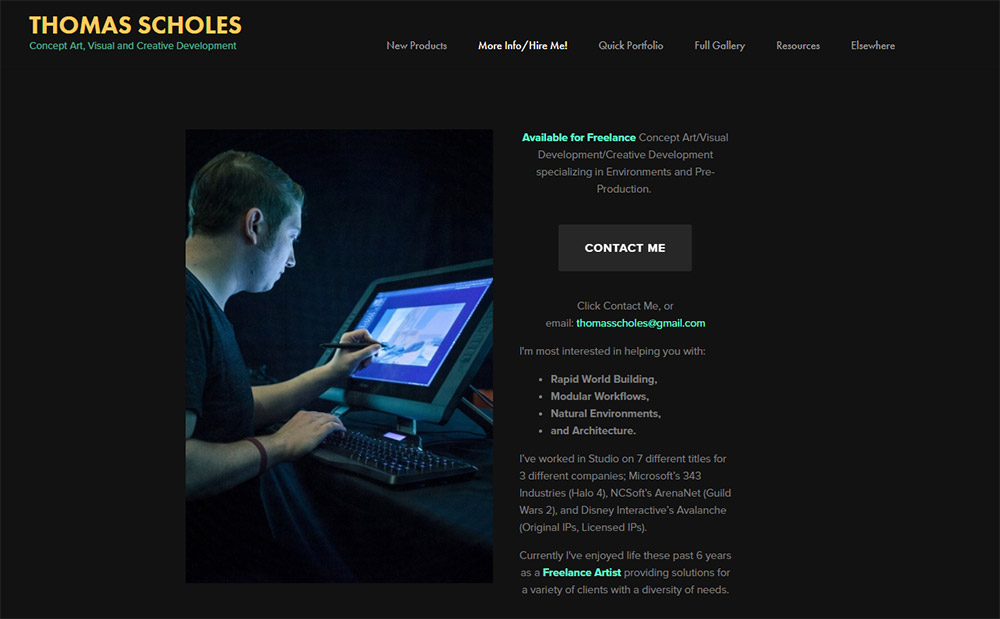
Thomas Scholes has a link in his navigation combining two pages: “about me” and “hire me”.
This is a wonderful idea if you want to save space on your site and reduce total pages. And once you click that link you’ll find a strong CTA encouraging visitors to send a contact email.
While I don’t think you need to actually display your full email address on the page, Thomas does this and it’s an option you can choose if you like.
One page I like a little more is this design on Matt Farley’s website.
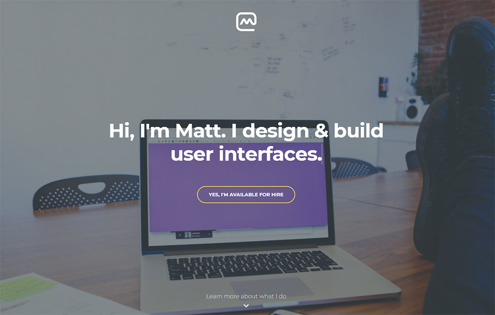
Matt is a fullstack developer and right on the homepage you’ll see a bright yellow CTA saying that he’s available for hire.
This is really helpful for clients who want to know if it’s worth their time messaging Matt with a project. Not to mention clicking that link scrolls you down to the contact section of the page.
Key point here: make it super-duper easy for potential clients to contact you. It shouldn’t be like pulling teeth just to ask for a quote on a project.
Add Dynamic Elements(Where Useful!)
If you’re comfortable with dynamic jQuery/CSS3 animations then I highly recommend adding them to your page.
Granted these are not required and will certainly complicate the design process.
But they’re guaranteed to grab attention and breathe more life into your website. Take for example the slideshow on Don Carey’s website.
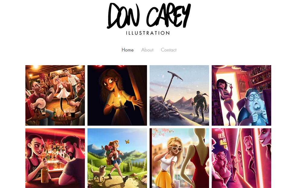
From the homepage click any of the thumbnails to see the full gallery in action.
It’ll overtake the entire page and you can scroll through each item to get a full view. It has a very simple fading animation effect that looks nicer than just switching images immediately on click.
Overtaking the screen with a slideshow is also a nice idea if you want to give visitors the “full experience” while browsing your work.
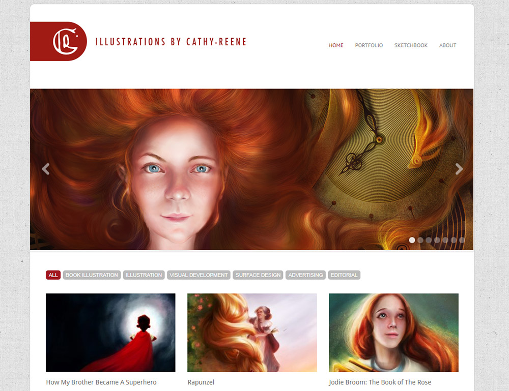
You’ll find a similar layout on Cathy-Renee’s site but this doesn’t have the fullscreen slideshow.
Instead you’ll find a dynamic carousel of works rotating above the main portfolio. It’s a nice feature added into the design but it’s certainly not a requirement.
What I like about Cathy’s design is the fixed-width layout only going so wide. This isn’t as useful for responsive layouts but it can work better for non-technical creative portfolios like writers & artists.
Now you could also push some dynamic page features like crazy. One example is the portfolio of Riccardo Zanutta.
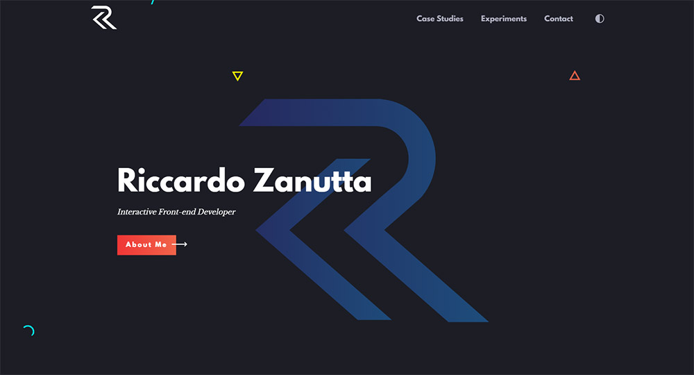
Brilliant typography, crazy motion graphics, cool animations and even a custom page loader.
This is not your “basic” portfolio website but it’s not meant to be.
This is designed to grab your attention and keep your interested in Riccardo’s work—and that’s exactly why you’d add dynamic features in the first place.
Moving Forward
I certainly hope these tips can help you craft a portfolio website that sells your work and increases your clientbase.
Every creative needs a portfolio but not everyone knows how to make it right.
By studying these trends, jotting down your favorites, and working in some new ideas you’ll have a solid foundation to launch a portfolio site that you’re proud to call your own.


Hy Jake,
You are absolutely right, The creative design is a more impressive to the users. Thanks for sharing!